Redesigning the Investing web application
Redesigning the Investing web application
Redesigning the Investing web application
My role
My role
My role
My role
Senior Product Designer
Senior Product Designer
Senior Product Designer
Senior Product Designer
Competencies
Competencies
Competencies
Competencies
UX/UI analysis
UX/UI analysis
UX/UI analysis
UX/UI analysis
Redesign
Redesign
Redesign
Redesign
Design system
Design system
Design system
Design system
Wireframing
Wireframing
Wireframing
Wireframing
Prototyping
Prototyping
Prototyping
Prototyping
Year
Year
Year
Year
2023
2023
2023
2023
I improved usability and visual consistency by redesigning existing interfaces with a cleaner, more intuitive UI/UX.
I improved usability and visual consistency by redesigning existing interfaces with a cleaner, more intuitive UI/UX.
I improved usability and visual consistency by redesigning existing interfaces with a cleaner, more intuitive UI/UX.
I improved usability and visual consistency by redesigning existing interfaces with a cleaner, more intuitive UI/UX.

Overview
Overview
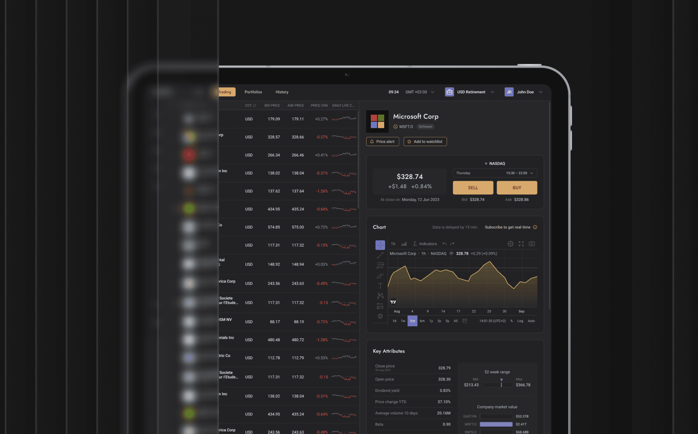
BankPro Invest is a comprehensive stock solution that includes real-time charts, news, fundamentals, and estimates.
BankPro Invest is a comprehensive stock solution that includes real-time charts, news, fundamentals, and estimates.
BankPro Invest is a comprehensive stock solution that includes real-time charts, news, fundamentals, and estimates.
BankPro Invest is a comprehensive stock solution that includes real-time charts, news, fundamentals, and estimates.
What's been done?
What's been done?
What's been done?

01.
01.
01.
01.
Trading section redesign: Updated the leading ‘Trading’ section using the UI kit for Bank Corporate. This involved rethinking the user interface design to improve visual appeal and overall user experience.
Trading section redesign: Updated the leading ‘Trading’ section using the UI kit for Bank Corporate. This involved rethinking the user interface design to improve visual appeal and overall user experience.
Trading section redesign: Updated the leading ‘Trading’ section using the UI kit for Bank Corporate. This involved rethinking the user interface design to improve visual appeal and overall user experience.
Trading section redesign: Updated the leading ‘Trading’ section using the UI kit for Bank Corporate. This involved rethinking the user interface design to improve visual appeal and overall user experience.
02.
02.
02.
02.
Redesign of general elements: Overhauled all general interface elements, including buttons, icons, headers, input fields, and more. The goal was to create a consistent and solid style for all interface components.
Redesign of general elements: Overhauled all general interface elements, including buttons, icons, headers, input fields, and more. The goal was to create a consistent and solid style for all interface components.
Redesign of general elements: Overhauled all general interface elements, including buttons, icons, headers, input fields, and more. The goal was to create a consistent and solid style for all interface components.
Redesign of general elements: Overhauled all general interface elements, including buttons, icons, headers, input fields, and more. The goal was to create a consistent and solid style for all interface components.
03.
03.
03.
03.
Layouts styled with UI Library: Developed all layouts using the provided UI kit for Bank Corporate to ensure consistency and visual sameness throughout the project.
Layouts styled with UI Library: Developed all layouts using the provided UI kit for Bank Corporate to ensure consistency and visual sameness throughout the project.
Layouts styled with UI Library: Developed all layouts using the provided UI kit for Bank Corporate to ensure consistency and visual sameness throughout the project.
Layouts styled with UI Library: Developed all layouts using the provided UI kit for Bank Corporate to ensure consistency and visual sameness throughout the project.
04.
04.
04.
04.
Layouts and components: Utilised predefined components and layouts to assemble layouts swiftly and seamlessly while maintaining consistency across the project.
Layouts and components: Utilised predefined components and layouts to assemble layouts swiftly and seamlessly while maintaining consistency across the project.
Layouts and components: Utilised predefined components and layouts to assemble layouts swiftly and seamlessly while maintaining consistency across the project.
Layouts and components: Utilised predefined components and layouts to assemble layouts swiftly and seamlessly while maintaining consistency across the project.
Challenges
Challenges
Challenges
Challenge / 01
Challenge / 01
Contrast issues
Contrast issues
Contrast issues
Low contrast prevents users from perceiving and reading important elements, leading to fatigue when using the interface.
Low contrast prevents users from perceiving and reading important elements, leading to fatigue when using the interface.
Low contrast prevents users from perceiving and reading important elements, leading to fatigue when using the interface.
Low contrast prevents users from perceiving and reading important elements, leading to fatigue when using the interface.

Challenge / 02
Focus shift when switching color themes
Focus shift when switching color themes
Focus shift when switching color themes
Inconsistency of colours and contrasts when switching between light and dark themes leads to unstable interface perception, which creates additional inconvenience for users.
Inconsistency of colours and contrasts when switching between light and dark themes leads to unstable interface perception, which creates additional inconvenience for users.
Inconsistency of colours and contrasts when switching between light and dark themes leads to unstable interface perception, which creates additional inconvenience for users.
Challenge / 03
Challenge / 03
Variety of design and lack of representation of UI elements states
Variety of design and lack of representation of UI elements states
Variety of design and lack of representation of UI elements states
Having different visual styles for the same type of elements makes it difficult to recognise the interface and creates confusion for users.
Having different visual styles for the same type of elements makes it difficult to recognise the interface and creates confusion for users.
Having different visual styles for the same type of elements makes it difficult to recognise the interface and creates confusion for users.
Having different visual styles for the same type of elements makes it difficult to recognise the interface and creates confusion for users.
The lack of representation of element states makes their behavior unpredictable, which worsens the user experience.
The lack of representation of element states makes their behavior unpredictable, which worsens the user experience.
The lack of representation of element states makes their behavior unpredictable, which worsens the user experience.
The lack of representation of element states makes their behavior unpredictable, which worsens the user experience.
Challenge / 04
Challenge / 04
Imbalance in layout and hierarchy of elements
Imbalance in layout and hierarchy of elements
Imbalance in layout and hierarchy of elements
The lack of a basic dimensional unit for indentation leads to interface heterogeneity. It makes it difficult to understand the visual hierarchy of elements, making it difficult to navigate and understand the application's structure.
The lack of a basic dimensional unit for indentation leads to interface heterogeneity. It makes it difficult to understand the visual hierarchy of elements, making it difficult to navigate and understand the application's structure.
The lack of a basic dimensional unit for indentation leads to interface heterogeneity. It makes it difficult to understand the visual hierarchy of elements, making it difficult to navigate and understand the application's structure.
The lack of a basic dimensional unit for indentation leads to interface heterogeneity. It makes it difficult to understand the visual hierarchy of elements, making it difficult to navigate and understand the application's structure.
Challenge / 05
Challenge / 05
Lack of components and complexity of working with layouts
Lack of components and complexity of working with layouts
Lack of components and complexity of working with layouts
The lack of required components makes the design and development process more time-consuming and difficult to create new functional elements.
The lack of required components makes the design and development process more time-consuming and difficult to create new functional elements.
The lack of required components makes the design and development process more time-consuming and difficult to create new functional elements.
The lack of required components makes the design and development process more time-consuming and difficult to create new functional elements.

Challenge / 06
Challenge / 06
Unorganised layouts
Unorganised layouts
Unorganised layouts
Unstructured layouts create additional difficulties for designers and developers, slow the workflow, and can lead to implementation errors.
Unstructured layouts create additional difficulties for designers and developers, slow the workflow, and can lead to implementation errors.
Unstructured layouts create additional difficulties for designers and developers, slow the workflow, and can lead to implementation errors.
Unstructured layouts create additional difficulties for designers and developers, slow the workflow, and can lead to implementation errors.

Design Solutions
Design Solutions
Solution / 01
Solution / 01
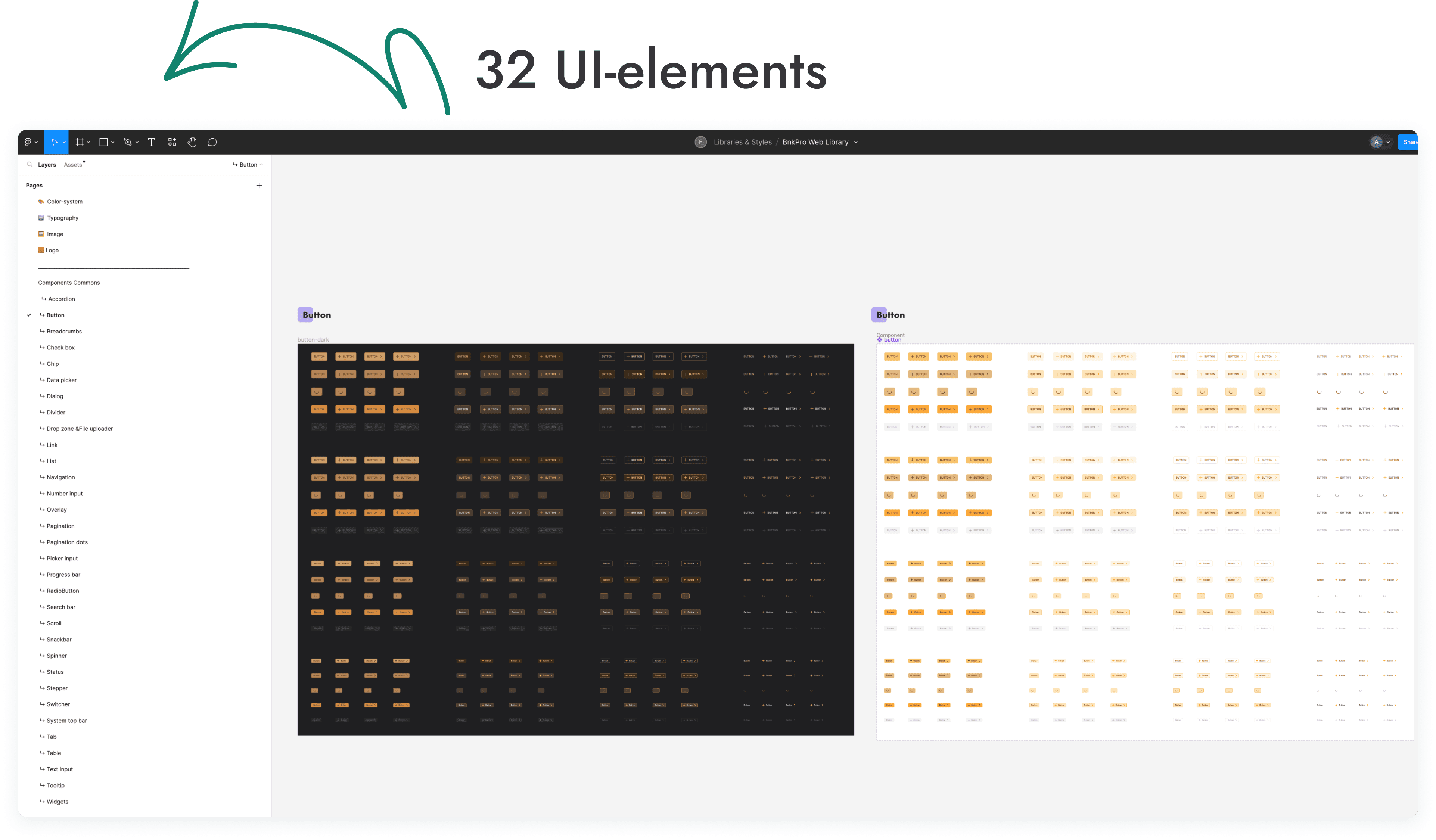
Reassembly of layouts on the basis of a single UI-library
Reassembly of layouts on the basis of a single UI-library
Reassembly of layouts on the basis of a single UI-library
Ensuring uniformity of visual realisation of elements.
Ensuring uniformity of visual realisation of elements.
Ensuring uniformity of visual realisation of elements.
Ensuring uniformity of visual realisation of elements.
Reflection of states for each UI element so that developers and users can evaluate their behavior in different scenarios.
Reflection of states for each UI element so that developers and users can evaluate their behavior in different scenarios.
Reflection of states for each UI element so that developers and users can evaluate their behavior in different scenarios.
Reflection of states for each UI element so that developers and users can evaluate their behavior in different scenarios.
Solution / 02
Solution / 02
Improved contrast and readability
Improved contrast and readability
Improved contrast and readability
Fixing contrast issues in the light theme to ensure key elements of the app are visible.
Fixing contrast issues in the light theme to ensure key elements of the app are visible.
Fixing contrast issues in the light theme to ensure key elements of the app are visible.
Fixing contrast issues in the light theme to ensure key elements of the app are visible.
Improved readability of text and UI elements for a better user experience.
Improved readability of text and UI elements for a better user experience.
Improved readability of text and UI elements for a better user experience.
Improved readability of text and UI elements for a better user experience.

Solution / 03
Solution / 03
Coordinating transitions between color themes
Coordinating transitions between color themes
Coordinating transitions between color themes
Providing a smooth transition betweenlight and dark themes by coordinating color palettes and focal elements.
Providing a smooth transition betweenlight and dark themes by coordinating color palettes and focal elements.
Providing a smooth transition betweenlight and dark themes by coordinating color palettes and focal elements.
Providing a smooth transition betweenlight and dark themes by coordinating color palettes and focal elements.


Solution / 04
Solution / 04
Component development and performance improvement
Component development and performance improvement
Component development and performance improvement
Extend the component library to simplify layout and improve productivity for designersand developers.
Extend the component library to simplify layout and improve productivity for designersand developers.
Extend the component library to simplify layout and improve productivity for designersand developers.
Extend the component library to simplify layout and improve productivity for designersand developers.

Solution / 05
Solution / 05
Interface responsiveness optimisation
Interface responsiveness optimisation
Interface responsiveness optimisation
Adding hover states for elements for a more responsive user experience.
Adding hover states for elements for a more responsive user experience.
Adding hover states for elements for a more responsive user experience.
Adding hover states for elements for a more responsive user experience.

Solution / 06
Solution / 06
Improving the organisation of layouts
Improving the organisation of layouts
Improving the organisation of layouts
Restructure layouts to reflect organisational best practices to make orientation and file handling easier for designers and developers.
Restructure layouts to reflect organisational best practices to make orientation and file handling easier for designers and developers.
Restructure layouts to reflect organisational best practices to make orientation and file handling easier for designers and developers.
Restructure layouts to reflect organisational best practices to make orientation and file handling easier for designers and developers.

Solution / 07
Solution / 07
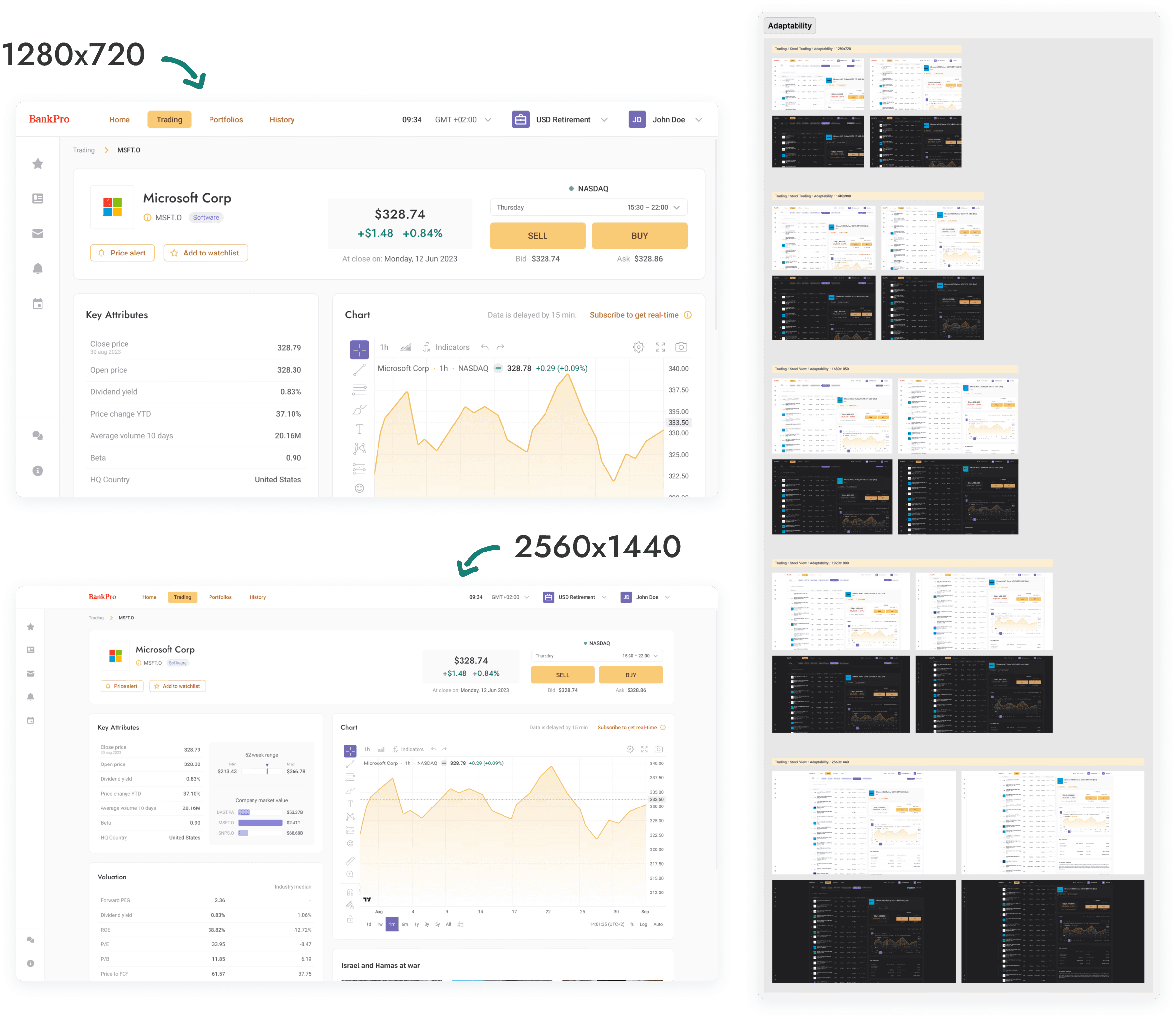
Adaptation of layouts for different screen sizes
Adaptation of layouts for different screen sizes
Adaptation of layouts for different screen sizes
1280x720
1440x900
1680x1050
1920x1080
2560x1440
1280x720
1440x900
1680x1050
1920x1080
2560x1440
1280x720
1440x900
1680x1050
1920x1080
2560x1440
The redesign improved UX through clearer layouts, responsiveness, and visual consistency. Unified components and smooth theme transitions enhanced performance and interaction quality.
The redesign improved UX through clearer layouts, responsiveness, and visual consistency. Unified components and smooth theme transitions enhanced performance and interaction quality.
The redesign improved UX through clearer layouts, responsiveness, and visual consistency. Unified components and smooth theme transitions enhanced performance and interaction quality.
The redesign improved UX through clearer layouts, responsiveness, and visual consistency. Unified components and smooth theme transitions enhanced performance and interaction quality.
© 2025 Aleksandra Berest
© 2025 Aleksandra Berest
© 2025 Aleksandra Berest
© 2025 Aleksandra Berest