Design system for a mobile banking app
Design system for a mobile banking app
Design system for a mobile banking app

My role
My role
My role
My role
Senior Product Designer
Senior Product Designer
Senior Product Designer
Senior Product Designer
Competencies
Competencies
Competencies
Competencies
UX/UI optimization
UX/UI optimization
UX/UI optimization
Interfaces analysis and audit
Interfaces analysis and audit
Interfaces analysis and audit
Consistency management
Consistency management
Consistency management
Visual hierarchy
Visual hierarchy
Visual hierarchy
Creating and documenting components
Creating and documenting components
Creating and documenting components
Versioning and system support
Versioning and system support
Versioning and system support
Year
Year
Year
Year
2023
2023
2023
2023
Audited the product and led the implementation of a design system that unified interfaces, sped up development, and simplified maintenance of the mobile banking app.
Audited the product and led the implementation of a design system that unified interfaces, sped up development, and simplified maintenance of the mobile banking app.
Audited the product and led the implementation of a design system that unified interfaces, sped up development, and simplified maintenance of the mobile banking app.

Discover
Discover
Discover
Overview
Overview
When I joined, the project lacked design support and consisted of outdated, inconsistent layouts with no unified visual style, components, or UI patterns. As the sole designer, I was tasked with systematizing the interfaces and creating a cohesive user experience.
When I joined, the project lacked design support and consisted of outdated, inconsistent layouts with no unified visual style, components, or UI patterns. As the sole designer, I was tasked with systematizing the interfaces and creating a cohesive user experience.
When I joined, the project lacked design support and consisted of outdated, inconsistent layouts with no unified visual style, components, or UI patterns. As the sole designer, I was tasked with systematizing the interfaces and creating a cohesive user experience.
When I joined, the project lacked design support and consisted of outdated, inconsistent layouts with no unified visual style, components, or UI patterns. As the sole designer, I was tasked with systematizing the interfaces and creating a cohesive user experience.
Hypotheses
Hypotheses
The lack of platform-specific adaptation led to non-compliance with iOS and Android guidelines, harming the user experience and complicating development.
The lack of platform-specific adaptation led to non-compliance with iOS and Android guidelines, harming the user experience and complicating development.
The lack of platform-specific adaptation led to non-compliance with iOS and Android guidelines, harming the user experience and complicating development.
The lack of platform-specific adaptation led to non-compliance with iOS and Android guidelines, harming the user experience and complicating development.
01
01
Inconsistent styling created visual gaps between screens and weakened the overall perception of the product.
Inconsistent styling created visual gaps between screens and weakened the overall perception of the product.
Inconsistent styling created visual gaps between screens and weakened the overall perception of the product.
Inconsistent styling created visual gaps between screens and weakened the overall perception of the product.
02
02
The absence of standardized components hindered the development of new features.
The absence of standardized components hindered the development of new features.
The absence of standardized components hindered the development of new features.
The absence of standardized components hindered the development of new features.
03
03
A lack of communication between designers and developers led to inconsistent implementation and frequent bugs.
A lack of communication between designers and developers led to inconsistent implementation and frequent bugs.
A lack of communication between designers and developers led to inconsistent implementation and frequent bugs.
A lack of communication between designers and developers led to inconsistent implementation and frequent bugs.
04
04

Research
Research
To test hypotheses, I began with an in-depth analysis of the product and its processes
To test hypotheses, I began with an in-depth analysis of the product and its processes
To test hypotheses, I began with an in-depth analysis of the product and its processes
UX/UI audit of existing interfaces
UX/UI audit of existing interfaces
UX/UI audit of existing interfaces
UX/UI audit of existing interfaces
Interviews with developers and testers
Interviews with developers and testers
Interviews with developers and testers
Interviews with developers and testers
Benchmark – studying the best practices in the market
Benchmark – studying the best practices in the market
Benchmark – studying the best practices in the market
Benchmark – studying the best practices in the market
Define
Define
Define
Overview
Overview
The research showed that the absence of a structured design approach impacted every stage of the user journey
The research showed that the absence of a structured design approach impacted every stage of the user journey
The research showed that the absence of a structured design approach impacted every stage of the user journey
✘
✘
✘
✘
Inconsistent UX: missing platform adaptation deviates from native patterns, causing user confusion and weakening brand perception.
Inconsistent UX: missing platform adaptation deviates from native patterns, causing user confusion and weakening brand perception.
Inconsistent UX: missing platform adaptation deviates from native patterns, causing user confusion and weakening brand perception.
Inconsistent UX: missing platform adaptation deviates from native patterns, causing user confusion and weakening brand perception.
✘
✘
✘
✘
Design debt: without reusable components, teams built UIs manually, increasing costs and fragmenting the design.
Design debt: without reusable components, teams built UIs manually, increasing costs and fragmenting the design.
Design debt: without reusable components, teams built UIs manually, increasing costs and fragmenting the design.
Design debt: without reusable components, teams built UIs manually, increasing costs and fragmenting the design.
✘
✘
✘
✘
Increased workload: manual fixes, layout mismatches, and lengthy reviews stemmed from the absence of a single source of truth.
Increased workload: manual fixes, layout mismatches, and lengthy reviews stemmed from the absence of a single source of truth.
Increased workload: manual fixes, layout mismatches, and lengthy reviews stemmed from the absence of a single source of truth.
Increased workload: manual fixes, layout mismatches, and lengthy reviews stemmed from the absence of a single source of truth.
✘
✘
✘
✘
Bug count increased: divergent design decisions complicated testing, while the lack of standardized components led to layout inconsistencies.
Bug count increased: divergent design decisions complicated testing, while the lack of standardized components led to layout inconsistencies.
Bug count increased: divergent design decisions complicated testing, while the lack of standardized components led to layout inconsistencies.
Bug count increased: divergent design decisions complicated testing, while the lack of standardized components led to layout inconsistencies.
✘
✘
✘
✘
Slow iterations: the absence of a standardized UI forced teams to recreate screens from the ground up."
Slow iterations: the absence of a standardized UI forced teams to recreate screens from the ground up."
Slow iterations: the absence of a standardized UI forced teams to recreate screens from the ground up."
Slow iterations: the absence of a standardized UI forced teams to recreate screens from the ground up."
GOAL OF THE PROJECT
GOAL OF THE PROJECT
Build a scalable design system that unifies visuals, speeds up development, and streamlines designer–developer collaboration.
Build a scalable design system that unifies visuals, speeds up development, and streamlines designer–developer collaboration.
Build a scalable design system that unifies visuals, speeds up development, and streamlines designer–developer collaboration.
Build a scalable design system that unifies visuals, speeds up development, and streamlines designer–developer collaboration.
Develop
Develop
Develop
Key tasks
Key tasks
01.
01.
01.
01.
Create a unified component library with separate adaptations for iOS and Android.
Create a unified component library with separate adaptations for iOS and Android.
Create a unified component library with separate adaptations for iOS and Android.
Create a unified component library with separate adaptations for iOS and Android.
02.
02.
02.
02.
Standardize spacing between interface elements.
Standardize spacing between interface elements.
Standardize spacing between interface elements.
Standardize spacing between interface elements.
03.
03.
03.
03.
Develop style guidelines for color, typography, and components.
Develop style guidelines for color, typography, and components.
Develop style guidelines for color, typography, and components.
Develop style guidelines for color, typography, and components.
04.
04.
04.
04.
Optimize UX patterns to streamline user interactions.
Optimize UX patterns to streamline user interactions.
Optimize UX patterns to streamline user interactions.
Optimize UX patterns to streamline user interactions.
05.
05.
05.
05.
Structure documentation with clear usage examples for each component.
Structure documentation with clear usage examples for each component.
Structure documentation with clear usage examples for each component.
Structure documentation with clear usage examples for each component.
Success Criteria
Success Criteria
Reduced development time for new features
Reduced development time for new features
Reduced development time for new features
Reduced development time for new features
Fewer errors and better alignment between design and implementation
Fewer errors and better alignment between design and implementation
Fewer errors and better alignment between design and implementation
Fewer errors and better alignment between design and implementation
Improved communication and collaboration between designers and developers
Improved communication and collaboration between designers and developers
Improved communication and collaboration between designers and developers
Improved communication and collaboration between designers and developers

Workflow
Workflow
What's been done?
What's been done?
Define visual standards
Define visual standards
Define visual standards
✣
✣
✣
✣
Updated the color palette and introduced a light theme to ensure a unified visual style across modes.
Updated the color palette and introduced a light theme to ensure a unified visual style across modes.
Updated the color palette and introduced a light theme to ensure a unified visual style across modes.
Updated the color palette and introduced a light theme to ensure a unified visual style across modes.
✣
✣
✣
✣
Created a font style system to maintain typographic consistency and improve content readability.
Created a font style system to maintain typographic consistency and improve content readability.
Created a font style system to maintain typographic consistency and improve content readability.
Created a font style system to maintain typographic consistency and improve content readability.
✣
✣
✣
✣
Standardized spacing to enhance layout structure and make interfaces more predictable.
Standardized spacing to enhance layout structure and make interfaces more predictable.
Standardized spacing to enhance layout structure and make interfaces more predictable.
Standardized spacing to enhance layout structure and make interfaces more predictable.

What's been done?
What's been done?
Assembled a component library
Assembled a component library
Assembled a component library
✣
✣
✣
✣
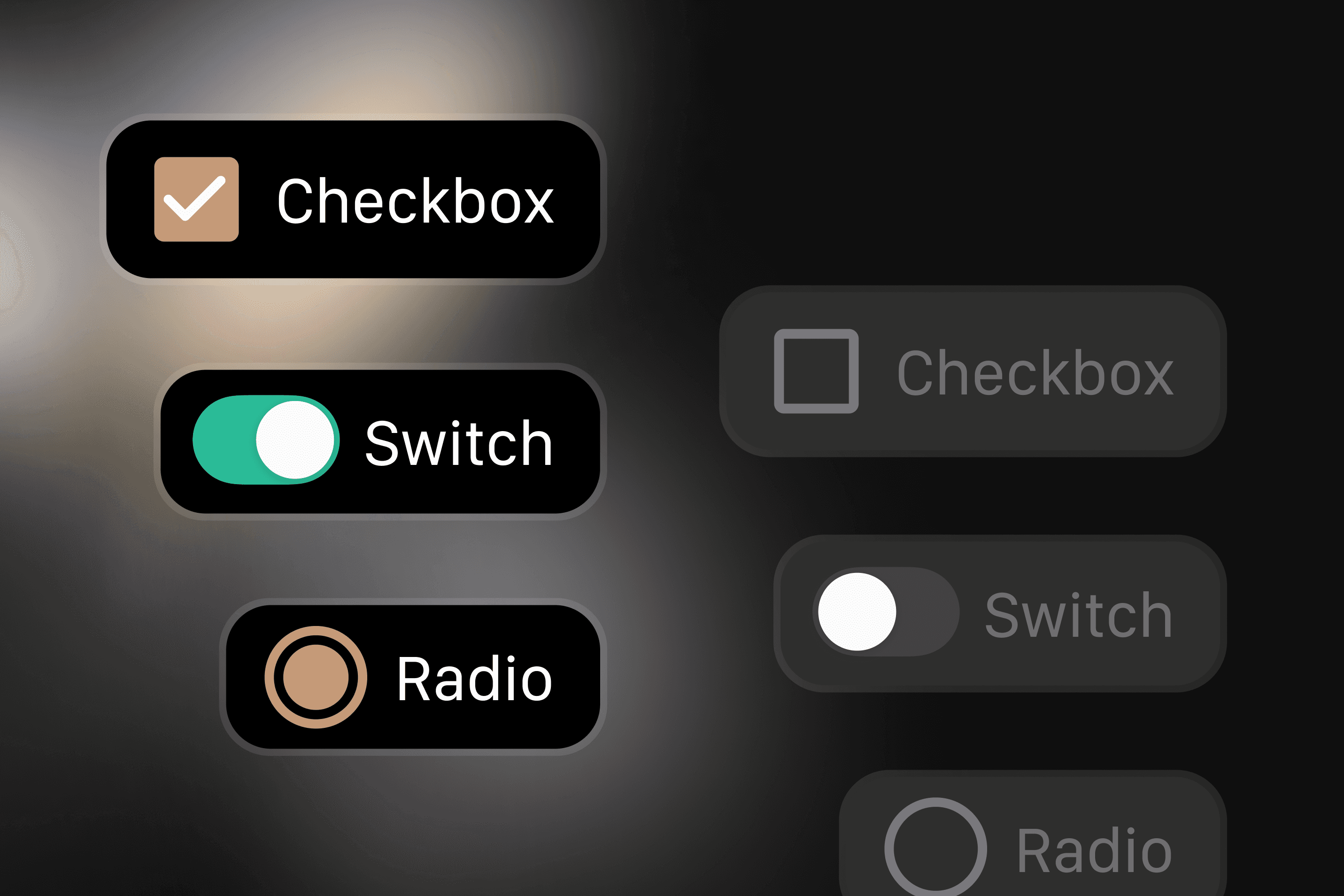
Created new design components and design tokens.
Created new design components and design tokens.
Created new design components and design tokens.
Created new design components and design tokens.
✣
✣
✣
✣
Developed scalable UI elements with platform-specific adaptations.
Developed scalable UI elements with platform-specific adaptations.
Developed scalable UI elements with platform-specific adaptations.
Developed scalable UI elements with platform-specific adaptations.
✣
✣
✣
✣
Defined rules for adapting interfaces to various scenarios, ensuring design consistency.
Defined rules for adapting interfaces to various scenarios, ensuring design consistency.
Defined rules for adapting interfaces to various scenarios, ensuring design consistency.
Defined rules for adapting interfaces to various scenarios, ensuring design consistency.
✣
✣
✣
✣
Supported development and refactoring to align the app with the updated design system.
Supported development and refactoring to align the app with the updated design system.
Supported development and refactoring to align the app with the updated design system.
Supported development and refactoring to align the app with the updated design system.
The pilot implemented and tested
The pilot implemented and tested
The pilot implemented and tested
✣
✣
✣
✣
Rolled out the design system on key screens to validate the approach.
Rolled out the design system on key screens to validate the approach.
Rolled out the design system on key screens to validate the approach.
Rolled out the design system on key screens to validate the approach.
✣
✣
✣
✣
Conducted design reviews to collect feedback and refine components.
✣
✣
✣
✣
Optimized solutions before full-scale implementation.

Deliver
Deliver
Deliver
Overview
Overview
Analysis of the implemented solution
Analysis of the implemented solution
Analysis of the implemented solution
After launching the design system, I evaluated its effectiveness by analyzing key metrics and gathering feedback from the team. We measured development speed by tracking how long it took to create new screens. To ensure quality, I conducted UX audits and usability testing.
After launching the design system, I evaluated its effectiveness by analyzing key metrics and gathering feedback from the team. We measured development speed by tracking how long it took to create new screens. To ensure quality, I conducted UX audits and usability testing.
After launching the design system, I evaluated its effectiveness by analyzing key metrics and gathering feedback from the team. We measured development speed by tracking how long it took to create new screens. To ensure quality, I conducted UX audits and usability testing.
After launching the design system, I evaluated its effectiveness by analyzing key metrics and gathering feedback from the team. We measured development speed by tracking how long it took to create new screens. To ensure quality, I conducted UX audits and usability testing.

Results
Results
Key outcomes of the design system implementation
Key outcomes of the design system implementation
Key outcomes of the design system implementation
✦
✦
✦
✦
Full visual and functional consistency across iOS and Android.
Full visual and functional consistency across iOS and Android.
Full visual and functional consistency across iOS and Android.
Full visual and functional consistency across iOS and Android.
✦
✦
✦
✦
Fewer design iterations before development.
Fewer design iterations before development.
Fewer design iterations before development.
Fewer design iterations before development.
✦
✦
✦
✦
Quicker feature approval with predefined components.
Quicker feature approval with predefined components.
Quicker feature approval with predefined components.
Quicker feature approval with predefined components.
✦
✦
✦
✦
Faster development through reusable elements and clear docs.
Faster development through reusable elements and clear docs.
Faster development through reusable elements and clear docs.
Faster development through reusable elements and clear docs.
✦
✦
✦
✦
Fewer bugs thanks to standardized components.
Fewer bugs thanks to standardized components.
Fewer bugs thanks to standardized components.
Fewer bugs thanks to standardized components.
✦
✦
✦
✦
Team leaders noted better design quality and higher stakeholder satisfaction.
Team leaders noted better design quality and higher stakeholder satisfaction.
Team leaders noted better design quality and higher stakeholder satisfaction.
Team leaders noted better design quality and higher stakeholder satisfaction.
As a result, the design system streamlined internal processes and significantly improved the user experience, making the BankPro product more modern and user-friendly. The team can now scale the product more efficiently while maintaining consistency and high quality.
As a result, the design system streamlined internal processes and significantly improved the user experience, making the BankPro product more modern and user-friendly. The team can now scale the product more efficiently while maintaining consistency and high quality.
As a result, the design system streamlined internal processes and significantly improved the user experience, making the BankPro product more modern and user-friendly. The team can now scale the product more efficiently while maintaining consistency and high quality.
As a result, the design system streamlined internal processes and significantly improved the user experience, making the BankPro product more modern and user-friendly. The team can now scale the product more efficiently while maintaining consistency and high quality.
© 2025 Aleksandra Berest
© 2025 Aleksandra Berest
© 2025 Aleksandra Berest
© 2025 Aleksandra Berest