B2B trucking web application:
Vektor
My role
Senior Product Designer
Competencies
Information architecture
End-to-end design
Design system
Data visualization
Wireframing
Prototyping
Year
2022-2023

I designed a SaaS solution for the trucking industry, providing comprehensive cargo management and flexible control for different categories of users.

What's been done?

01.
Led end-to-end product design cycle from concept to detailed mock-ups for key scenarios.
02.
Prepared MVPs for A/B testing and user testing.
03.
Developed the design system, standardizing elements for accelerated development and visual consistency.
04.
Revamped the visual style, making the interface modern and consistent with the brand.
05.
Expanded functionality and customized the interface for different roles.
Overview
Optimization of logistics through thoughtful UX
The project is aimed at trucking company owners who need a reliable and intuitive transportation management tool. At the start there was a basic MVP that required expansion, addition of key features and a complete redesign.

Problem
Searching for lost logic: uncovering architectural problems
The system at launch was fragmented, with no clear logic or structure. Gaps in the information architecture made navigation difficult, making the user journey fragmented. Finding the right sections was difficult, and some key scripts required unnecessary actions or were missing altogether.
Solution
Mapping UX gaps
To identify these issues, together with another designer, we created a UX-map detailing the current functionality.We also conducted interviews with business owners and users of similar platforms. This helped us identify “holes” in the architecture and prioritize improvements. Competitor analysis and discussions with the team allowed us to form a list of key features that became the basis for the new system concept.

Problem
Lost in the UI jungle
Initial layouts didn't use components and had inconsistent fonts and colors. Because of this, developers had to manually create and adapt UI elements for each new case, which slowed down the process and complicated support.
solution
The path to order: standard components instead of the eternal crutch
After discussions with developers, we chose MUI Design as the basis for the UI components. On its basis, together with another designer, we created a local design system, which accelerated the work with layouts, ensured uniformity of interfaces and simplified product support.
They also had to create a new visual identity for the product from scratch. Given the highly loaded nature of the system, I chose a minimalistic and lightweight design that emphasized simplicity, speed, and intuitive interaction.
We built a local design system, streamlining workflow, ensuring UI consistency, and simplifying maintenance. A new visual identity improved speed and scalability, cutting design time.

Сhallenge
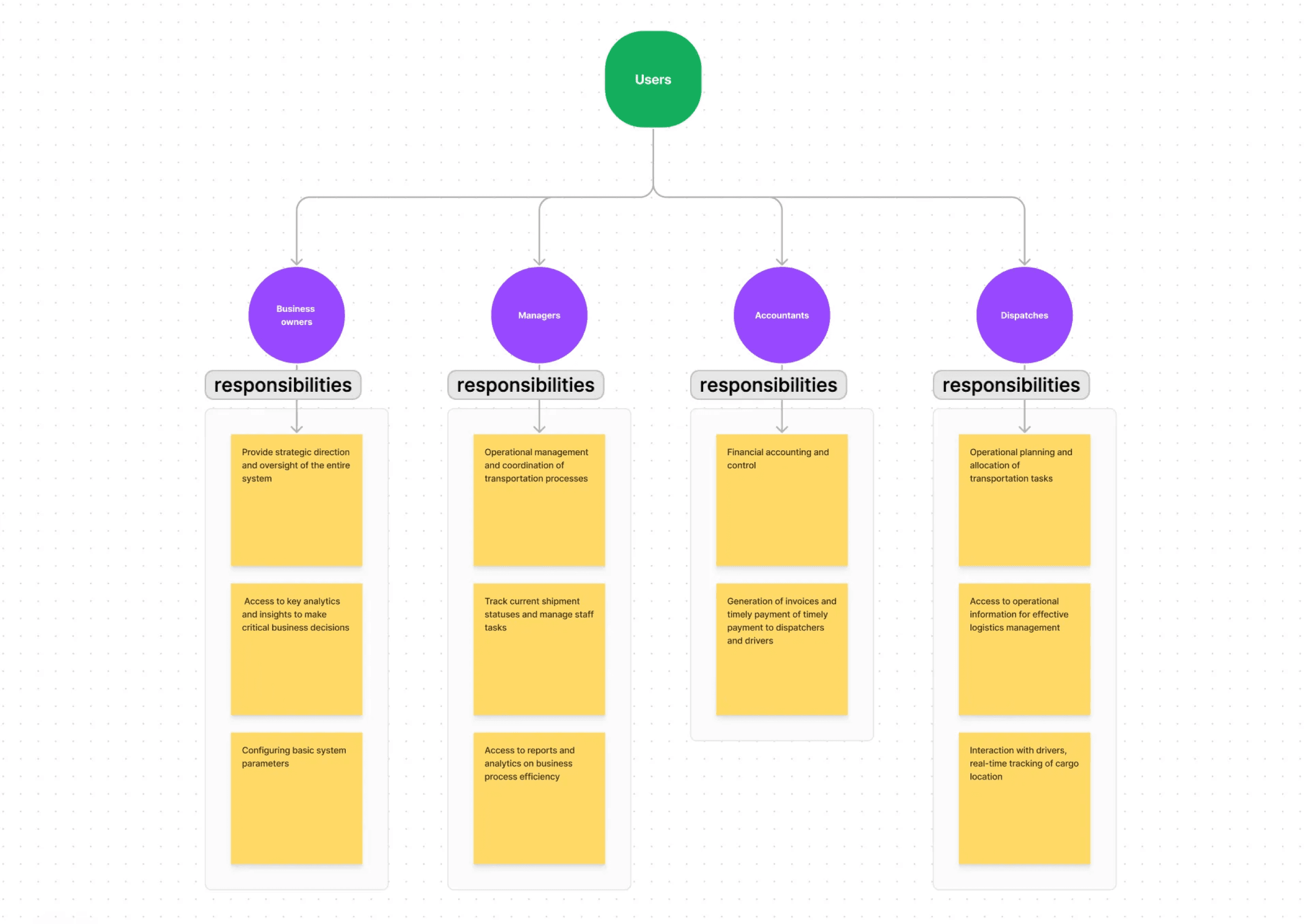
One platform, many roles
The interface had to be customized for different roles: business owners, managers, accountants and dispatchers. Each group had different tasks, work scenarios and priorities, which required a customized design approach.
Approach
User-centric design
To address their challenges, I conducted a series of interviews with representatives from each role, exploring their workflows and pain points. This helped me to create a clear structure of interfaces adapted to the tasks of different users.

Everyone in their place:
interfaces designed for roles.
Designing a unified interface for different roles is challenging yet valuable. As a result, we identified each group's needs, deeply understood their workflows and pain points, and integrated everything into a cohesive, user-friendly system.
Сhallenge
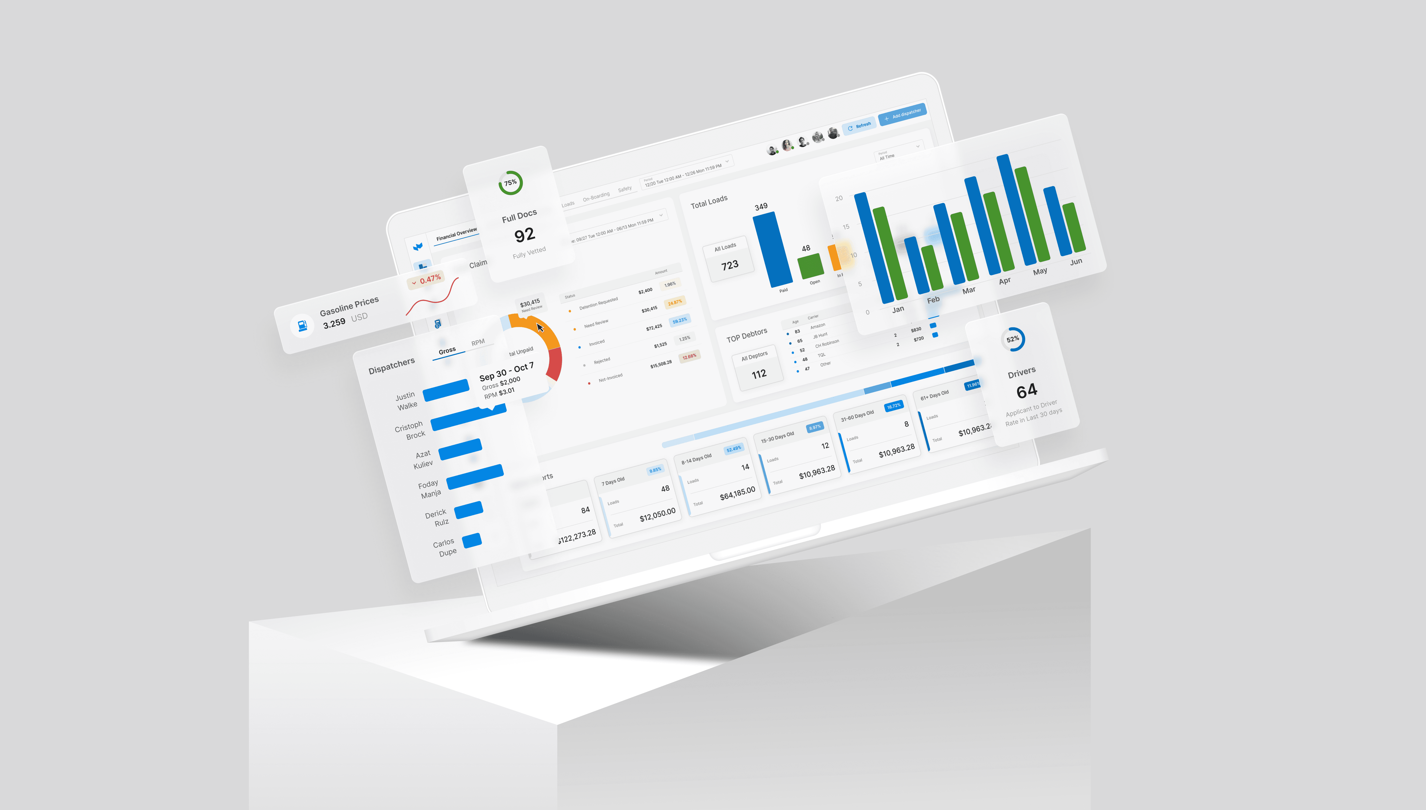
Data is power when it speaks clearly
One of the main challenges was working with massive amounts of data and transforming complex logistics processes into an understandable interface. Users, from business owners to dispatchers, needed to quickly find the correct information and make decisions without making mistakes that could lead to financial losses.
The task required not only in-depth data analysis but also a creative approach to data visualization to make the interface intuitive and interaction with the system simple and convenient.
Approach
Transforming data into clear visuals
At the first stage, I studied the data in detail and highlighted key information, which, when visualized, should clearly display the main indicators for users.
Then I started working on design solutions: experimenting with charts, graphs and interactive elements to find the best way to present complex information.
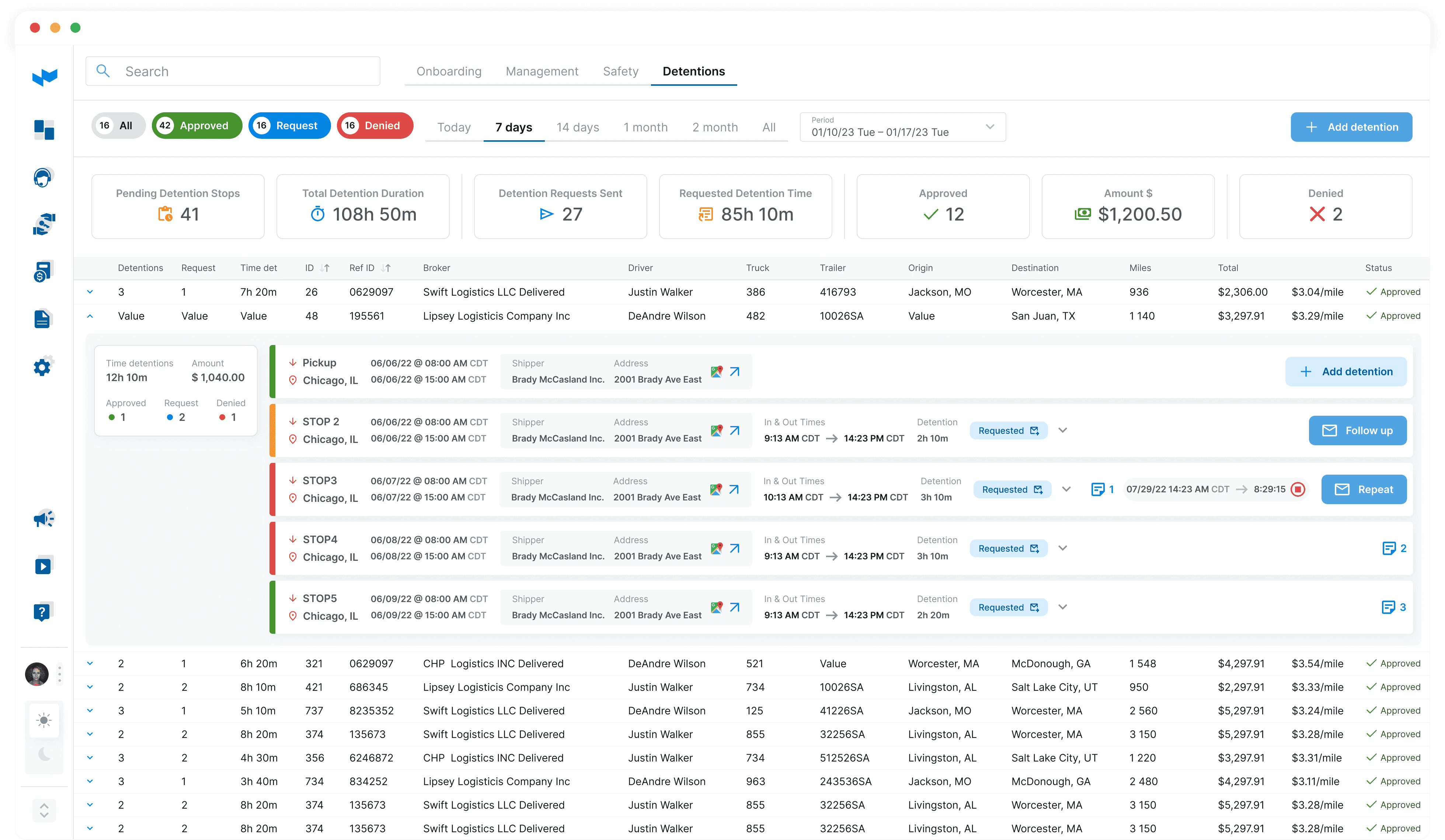
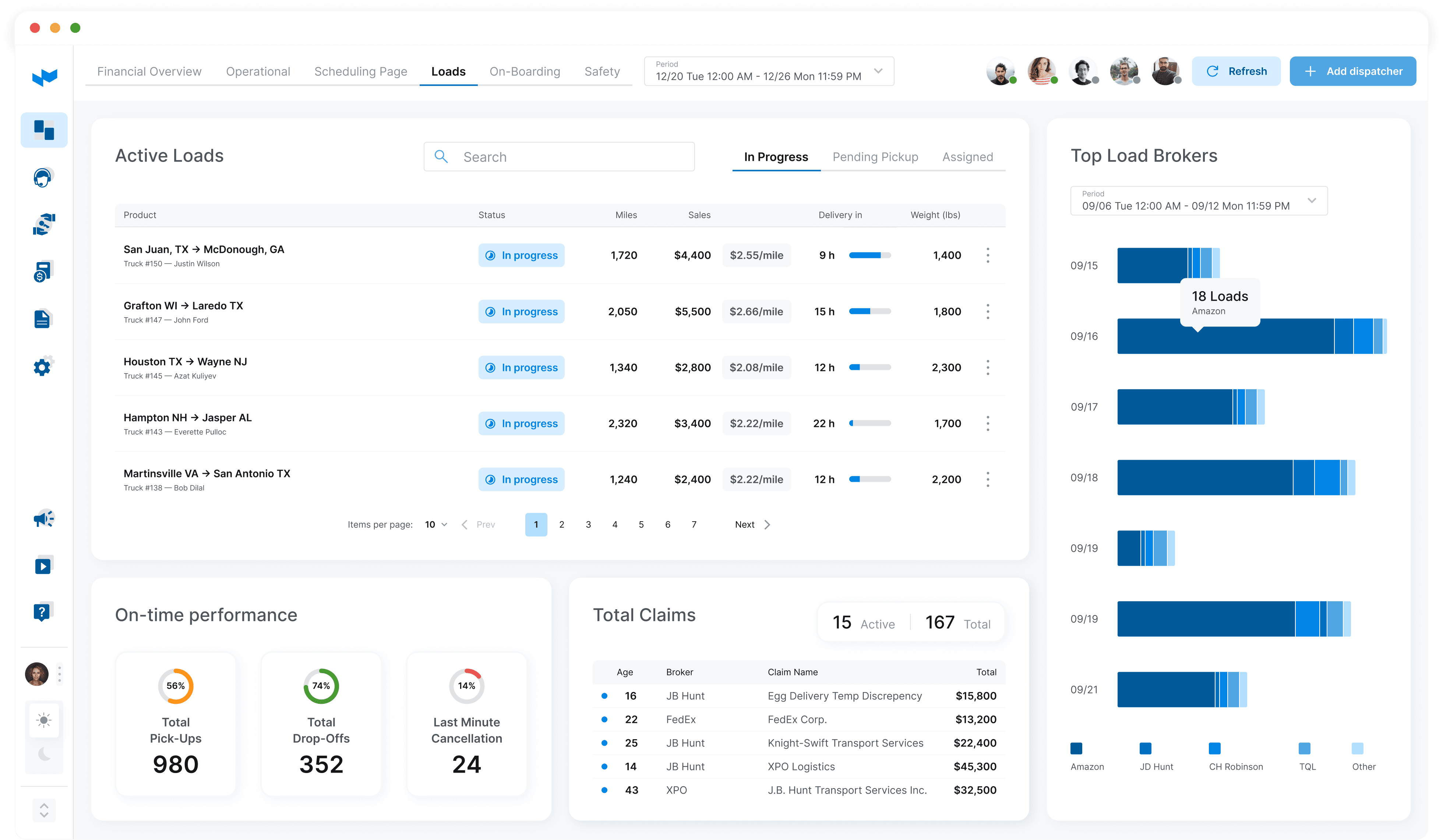


The design was iterative — concepts were refined based on feedback from stakeholders and tested using A/B tests. This approach allowed us to create an interface that combines analytical depth with user-friendliness, providing users with an accurate and understandable presentation of data.


We went through the entire product development cycle — from analyzing current solutions to an updated version that meets user needs and business goals. As a result, the business received a structured, user-friendly, and competitive platform.
© 2025 Aleksandra Berest